Do you have multiple Aweber forms on your website? What happens when you hit TAB on the keyboard? Right, it breaks completely. Here is how to fix it.

While editing my latest blog post on Content Marketing, I found very strange behavior in my Aweber forms.
What happens?
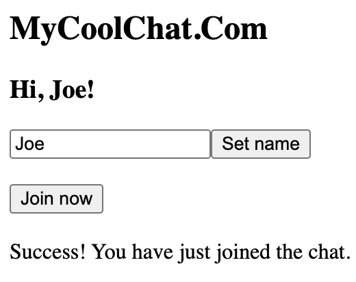
Let’s say you have a form similar to mine (see below).
Once your user enters their name in the “Name” field, they will probably want to switch quickly to the “Email” field.
And how do you do that?
Exactly.
The user can press TAB to jump to the next input field.
But what happens if you have multiple Aweber forms on the same page?
Well, bad luck… In this situation, pressing TAB will randomly switch the user to another form on the same page.
And they will have to start all over again…
Do you think the user will go back to fill in the remaining?
No way, they will lose patience and won’t sign up at all…
So, you lost one potential customer.
How to fix the random switch between Aweber forms
Aweber answered in their official article here. But this is not a good way…
(Come on, you won’t edit your forms manually and paste a gigantic raw HTML Aweber asks you to…)
So how do you fix this issue then?
Well, I created a small script that takes care of it.
Just add the following code in the footer of your blog, and the problem will be gone.
<script>
jQuery(document).ready(function() {
jQuery(".af-element input").each(function(i, item) {
  jQuery(item).attr("tabindex", 600 + i);
})
});
</script>
Code language: HTML, XML (xml)
If you are not into coding, you can install this plugin and watch the video below to see how to add the code from the UI.
Note, if you use the plugin, you will only have to add the code below (make sure you select JS as an option and “add in Footer” on the plugin page).
jQuery(document).ready(function() {
jQuery(".af-element input").each(function(i, item) {
  jQuery(item).attr("tabindex", 600 + i);
})
});Code language: JavaScript (javascript)
If you are using any caching plugins, don’t forget to clear the cache before testing the result.
Final thoughts
Aweber is a great choice for collecting subscribers, but there are things they need to improve…
Aweber forms use an outdated code that breaks the user experience when the user tries switching between the input fields (by pressing TAB).
In this post, I showed you a quick way to fix the issue in the blink of an eye.
That’s it, basically…
All your forms on the page will work just fine when you press the TAB button.
(And you won’t lose any more customers due to this.)
P.S. Don’t forget to subscribe to my blogging mini-course below.


![Java NullPointerException (NPE)? Quick FIX [Do this first!] java-null-pointer-exception-fix-2](https://igorjovanovic.com/wp-content/uploads/2023/05/java-null-pointer-exception-fix-2.png)
![How to resolve IndexError: list index out of range in Python [once and for all!] IndexError list index out of range_1_(2)](https://igorjovanovic.com/wp-content/uploads/2023/04/IndexError-list-index-out-of-range_1_2.png)


![Python Beginners Guide: The way rich kids are taught [2024] FA646E56-BD48-4528-9C03-E02D7E6142C3](https://igorjovanovic.com/wp-content/uploads/2022/09/FA646E56-BD48-4528-9C03-E02D7E6142C3.jpeg)
